-
Tom Slaughter | Recession Prints I – IV
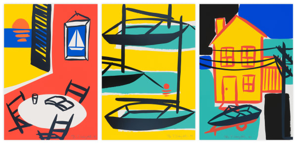
Tom Slaughter, known for his boldly colored paintings and prints in strong, graphic lines, has worked with Durham Press since its inception. Beginning with the 1996 edition Zito's, Slaughters prints with the Press draw directly from his paintings. For Slaughter, his work can be made in any medium - "I paint, draw, cut paper, use a computer, and even an iPhone - it's all the same hand." Slaughter's collaborations with Durham Press were deeply connected to his body of work, giving him a new medium to experiment with color and form through each iteration of his editions. The graphic, almost flat nature of his work translates seamlessly to print, rendering vibrant and playful imagery that recalls Pop art. Influenced by artists such as Lichtenstein and Warhol, Slaughter's work toes the line between fine art and commercial. He often works with what he refers to as "icons" - every day imagery reduced to their essential parts - that creates a level of innocence while still exploring concepts of formalism and modernism. Slaughter's use of primary colors, pulling from artists such as Calder and Mondrian, provides a clarity that matches the straightforwardness of his subjects. He says: "Icons…these are my alphabet. I draw them over and over until they are part of my language. Sunglasses, bikes, hats, boats, buildings…they are all just part of an excuse to make images." Slaughter plays with this 'language' in his Recession Prints series. The sixteen screenprints focus on a single subject in primary colors, with the addition of green, to break down commonplace objects to their foundation, creating a sense of comfort with their playful lines and sense of familiarity.
-
Much of Slaughter's work is inspired by his life in New York and costal Long Island: water towers that fill the city skyline, bakeries and restaurants that line the streets, or empty boats docked in the ocean. The paintings and prints rarely feature figures, instead using architecture and objects to investigate the core structure of the city he lives in, not the people that inhabit it. However, people remain present in his work as they are tied to and exist in that core structure; in The Old Neighborhood series, a bike sits waiting to be ridden, a shoe without its foot, and a cappuccino ready to be drank - each become stand ins for the people that would use them.
-
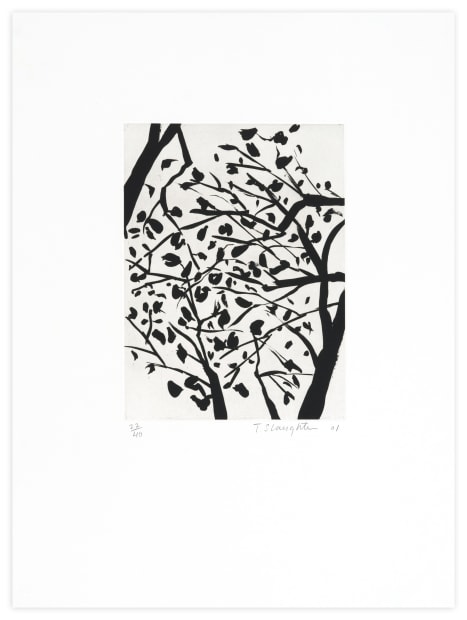
Always drawing from his surroundings, Slaughter was inspired by the landscape around him while he worked at Durham Press, located in Buck’s County, Pennsylvania when creating the series Trees of Bucks County. This series was Slaughter’s first foray into the medium of etching which offers a very different quality than his woodblock and screenprints; the softer, black and white quality of sugarlift and aquatint captures the rhythmic nature of the sparse winter trees that line the Press, while still remaining true to Slaughter’s previous work. He brings these trees into the language of his “icons,” breaking them down to their essential parts with swaying limbs branching out from their strong trunks, all rendered in his characteristic bold lines. The resulting prints are strong but delicate, created from painterly lines that move across the page just like the swaying trees.
Tom Slaughter | Through the Years
viewing_room